In this topic we will be discussing on how different cultures will affect design.
What is Cross-cultural Design?
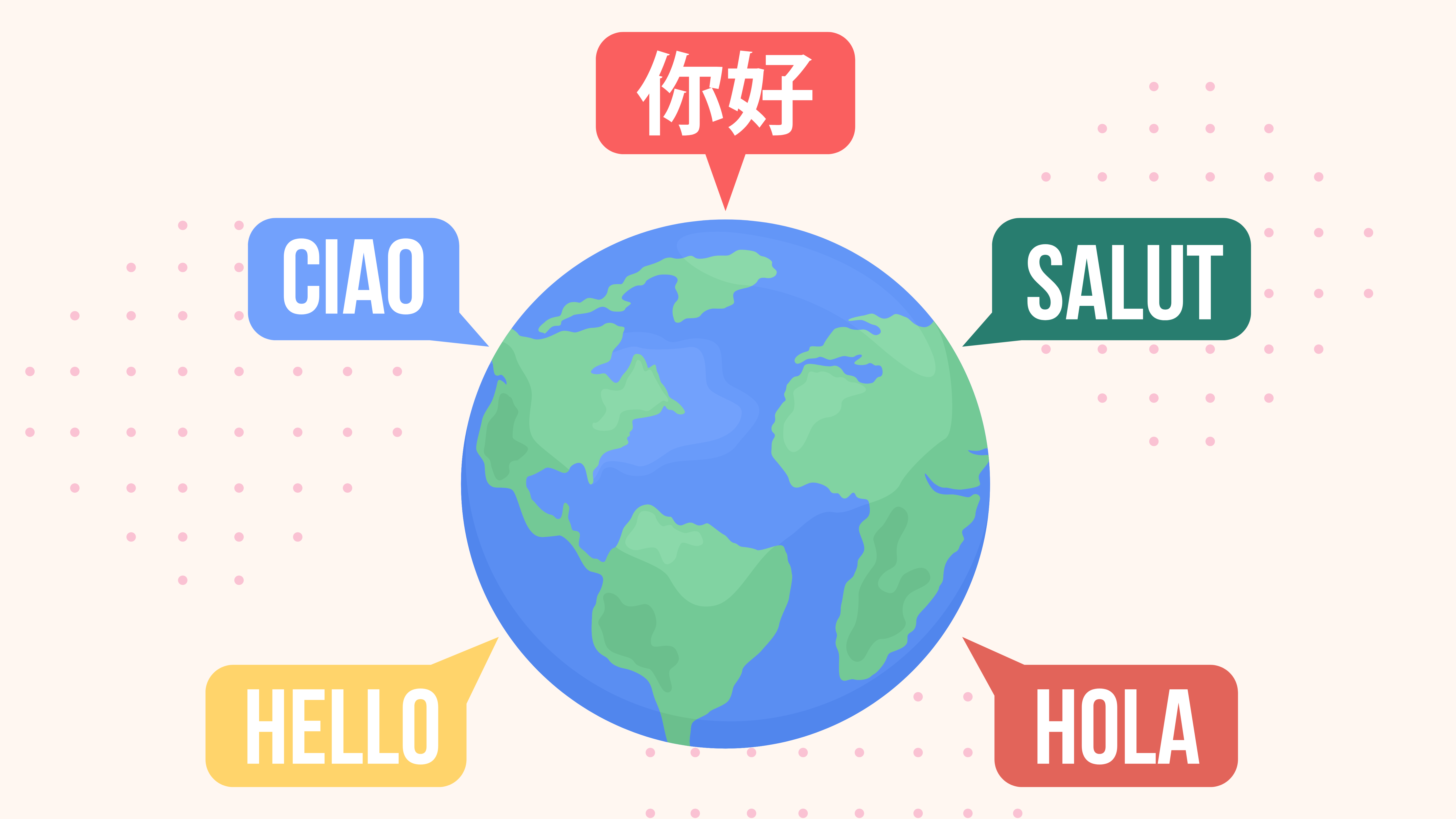
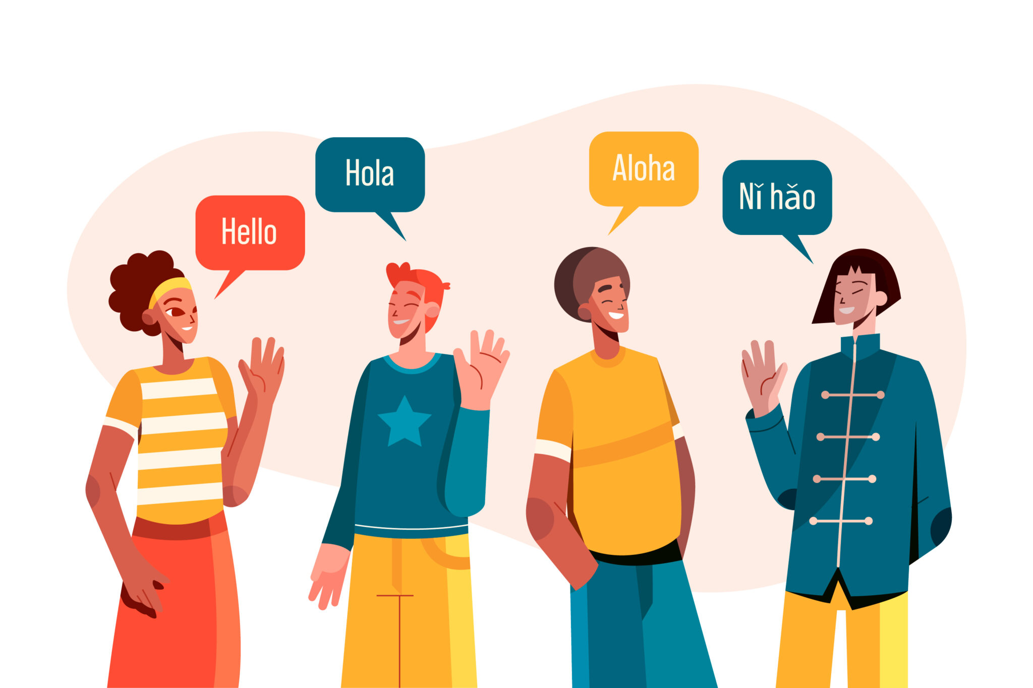
Cross-cultural design focuses on understanding how design can be informed and influenced by cultures. The practice of designing for cross-cultural considerations includes modifying and adapting design elements, such as images, color, and layouts, to support customer and business needs for different cultures.
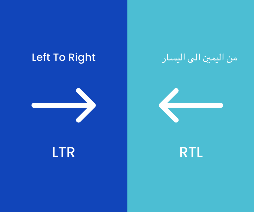
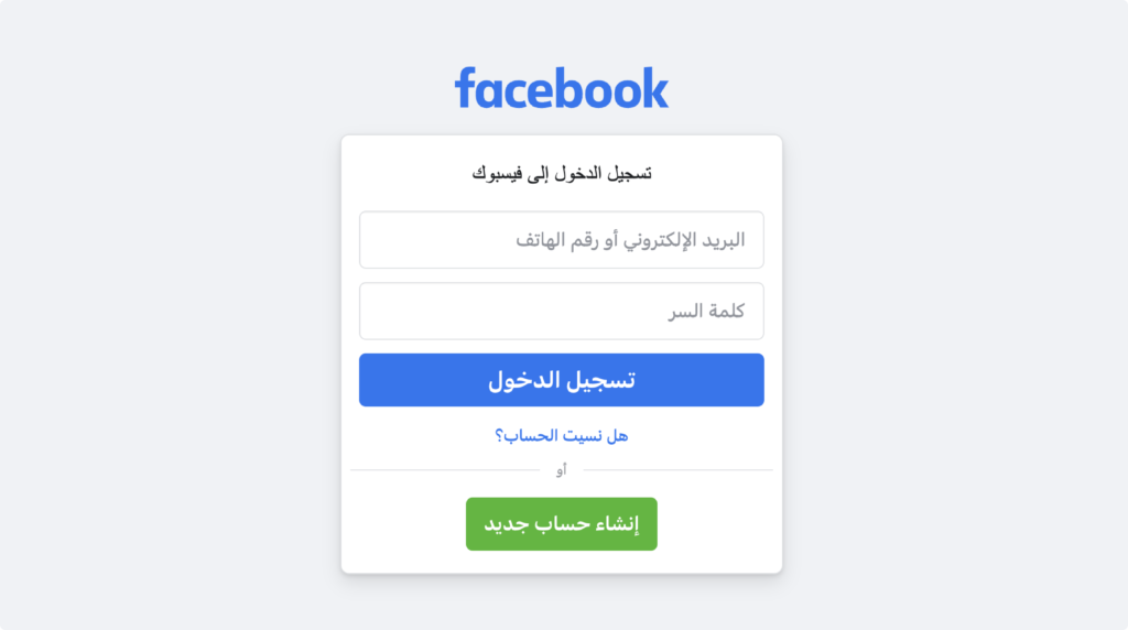
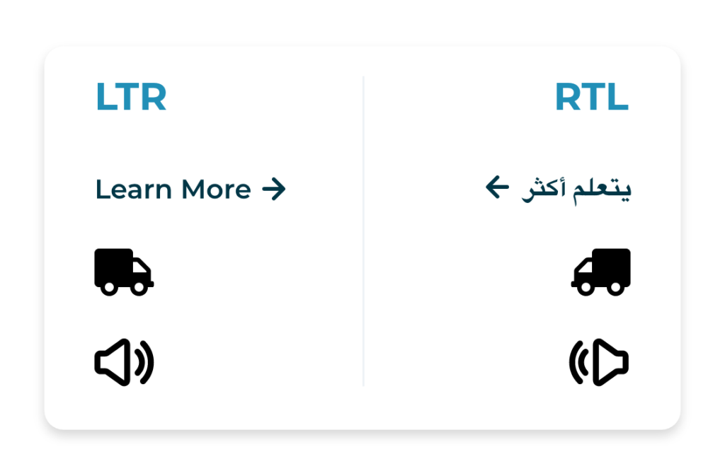
All functional elements in RTL graphical interfaces have to be mirrored from left-to-right to right-to-left.
For example, most Western languages, as well as many others around the world, are written LTR. The opposite of LTR, RTL (Right To Left) is used in other common languages, including Arabic and Hebrew.
The same app in different countries might have different designs. In certain cultures, specific design patterns are accepted as universal. However, there are some universal UI elements that we see frequently that may not exist or be used in other country app design.
There are Two Types of Adaptation
- Translation: The look and feel of the product stays the same, the only difference is the language.
- Localisation : Refers to making the design of the digital product culturally relevant to the target audience. The visual layout can be totally different.
![]()
I. Understanding cultural differences
Most countries, including English-speaking countries such as the United States, Canada, Australia, and the United Kingdom, use left-to-right (LTR) writing systems in their apps and software.
![]()
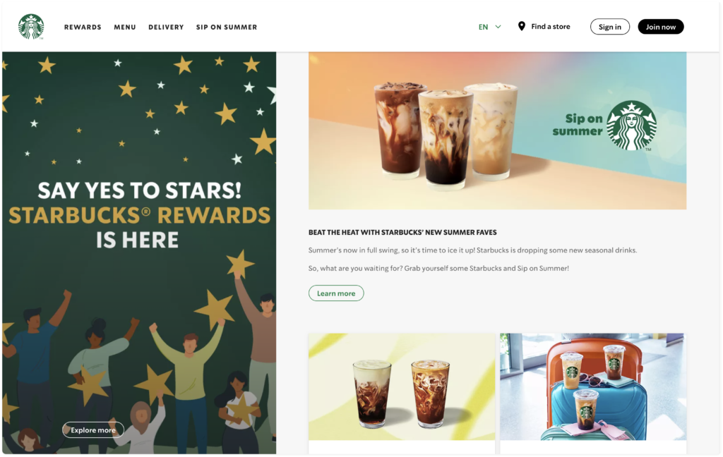
STARBUCKS
Left-to-Right (LTR)
Right-to-Left (RTL)

Left-to-Right (LTR)
Right-to-Left (RTL)
II. How should we design for bi-directional?

![]()
a. Text or Sentences
We mirror the design elemets and contents such as title, body text, ratings, button.
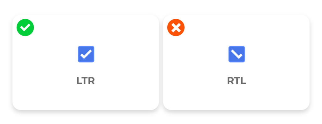
b. Icons that represent movement, text, and direction
b. Icons that represent text or reading direction
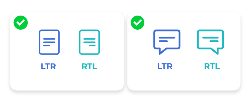
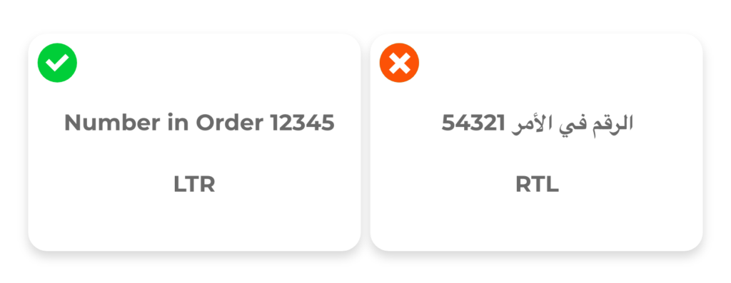
For example, if an interface icon uses left-aligned bars to represent text in the LTR context, then we will need to right-align the bars in the RTL context.
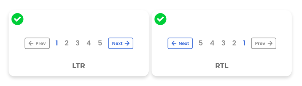
c. Navigation
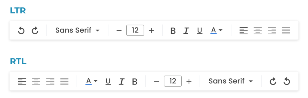
d. Progress Indicator

e. Icons, buttons, menu
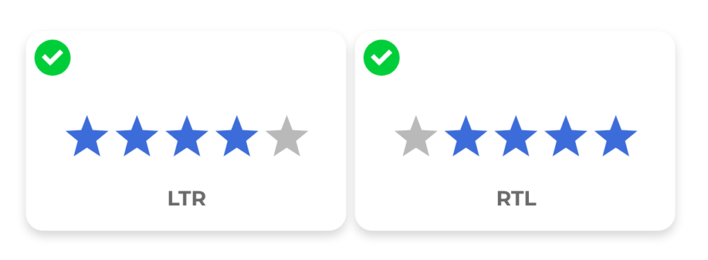
f. Ratings
g. Page indicators
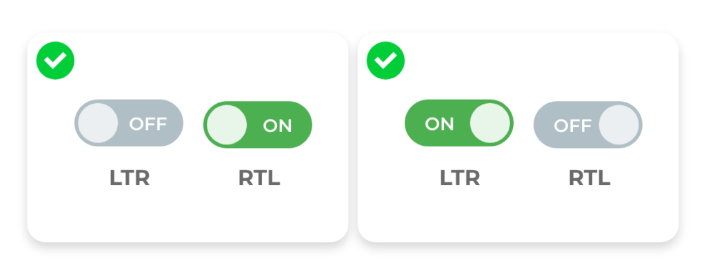
h. Toggle
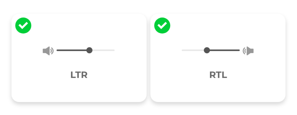
i. Slider

![]()
a. Text or Sentences
b. Checkbox
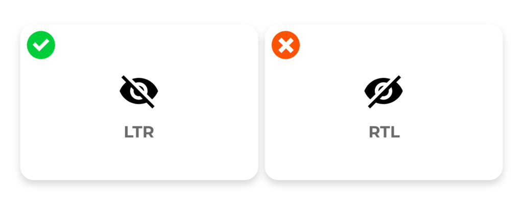
c. Slash
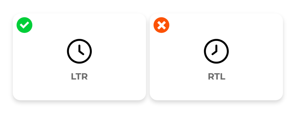
d. Icons represent time
e. Media controls


Every brand has its own guidelines in UI design, which is highly recommended to follow. If you want your design to speak internationally, it is very important to keep it consistent but giving a small tweak to localize within the country itself, can make a big difference.
![]()
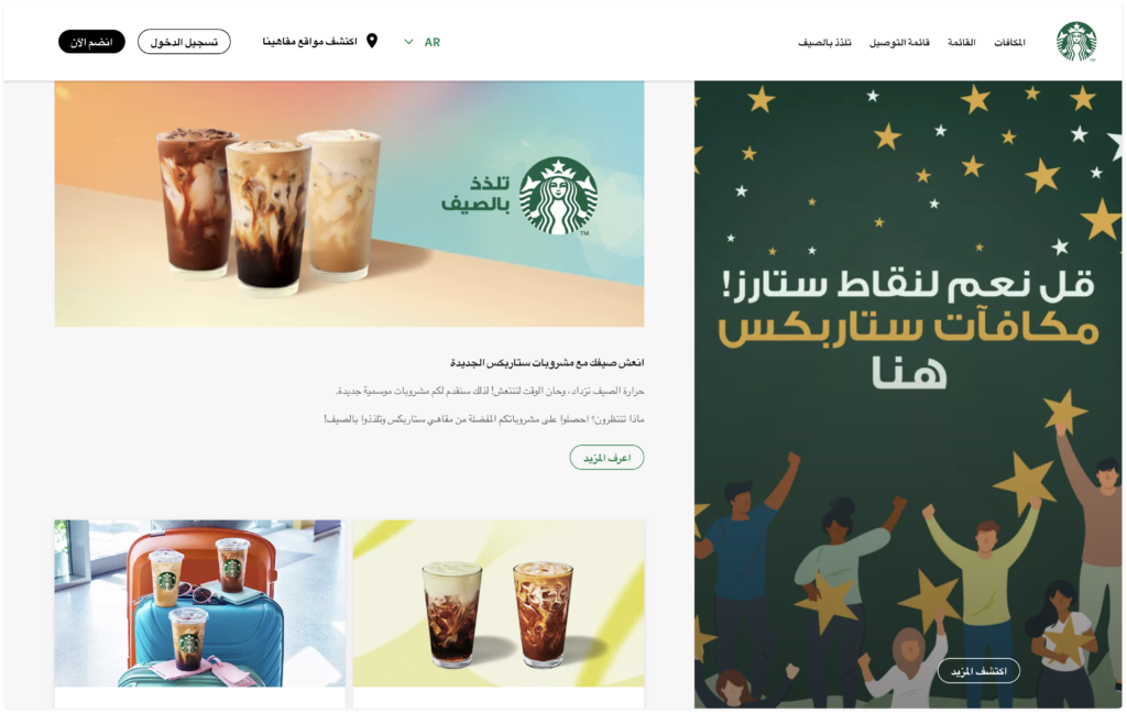
STARBUCKS in CHINA

The China website design of Starbucks places a strong emphasis on user registration and login. Upon the first glance, users are immediately drawn to the prominently displayed login and register options on the left side. On the right side, there are enticing prompts encouraging users to join Starbucks memberships to enjoy exclusive rewards.
![]()
STARBUCKS in JAPAN
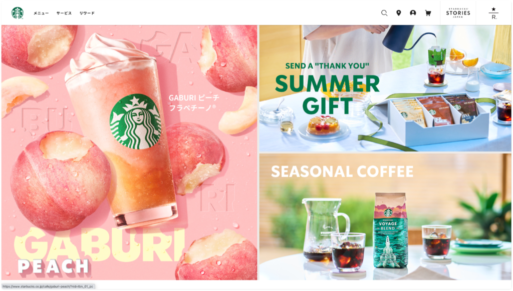
The design of Starbucks’ website in Japan prominently highlights their newly launched products and seasonal beverages. Given the cultural significance of gift-giving when visiting friends or relatives in Japan, the website also incorporates persuasive copywriting related to gifting, aiming to attract users through this approach.

MCDONALD in CHINA
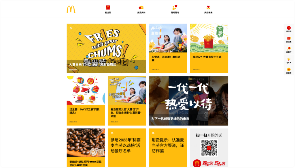
The design of Mcdonald’s website in China is more information and there is less spacing compared to western websites. China designs are aimed to provide a wide range of information and content to users. China apps are often prized for their high functionality which would result in a more densely packed UI design. This approach allows users to access various services conveniently and efficiently, without the need to navigate through different screens or menus extensively.
![]()
QQ.COM in CHINA
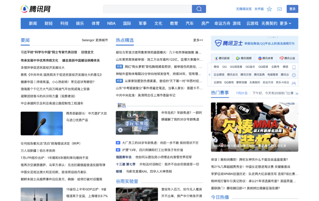
An example of the news website from QQ.COM in China. There are no spaces needed between characters in Chinese. There is also no capitalisation, so that’s why making it difficult to divide content when initially viewing the page from a Western perspective. The design for QQ website is more information heavy as all the news category and title are placed in one page. There is less spacing compared to western websites. China designs are aimed to provide a wide range of information and content to users. Which results in a lack of hierarchy in their website design.
MCDONALD in AUSTRALIA
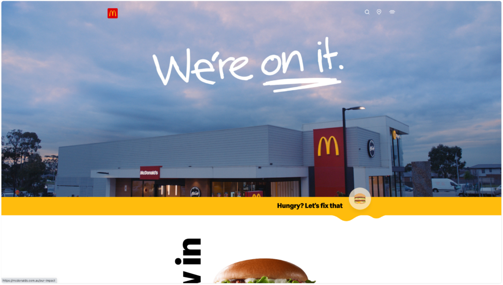
The design of Mcdonald’s website in Australia was a western style that more emphasize on spacing and layout hierarchy. Western design are often hide the information in a menu to show the only most essential information to users.
![]()
BBC NEWS Website
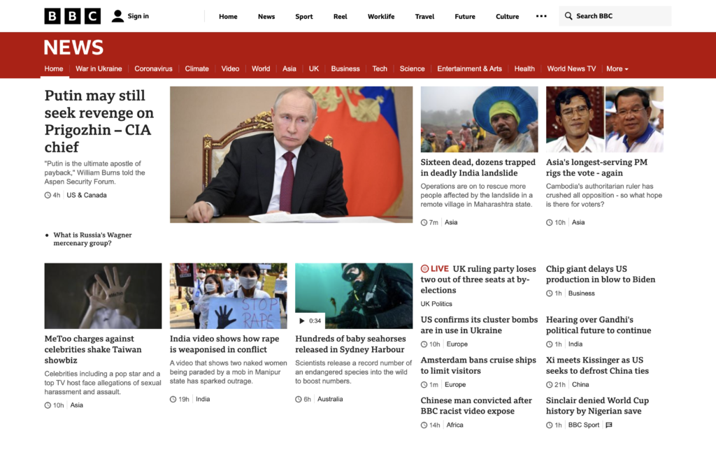
BBC is widely recognized as a highly popular news website across the Western world. It is evident that they employ F-shape reading patterns, as they prioritize the latest and most trending news with a prominent header and larger image, effectively guiding users in their reading direction.
However, people are creatures of habit, and their habitual behaviors can influence their perceptions and preferences regarding design. Chinese apps or the web may be perceived as too clutter for western users. The complexity of Chinese characters and design elements might feel overwhelming and unfamiliar.
On the other hand, a Western app’s minimalistic design might appear too simplistic and lacking functionality to a Chinese user who is used to more information-rich interfaces.
In conclusion, embracing cultural adaptation in design not only enhances user experiences but also fosters stronger connections with audiences around the world, facilitating meaningful interactions and building bridges between diverse communities.